How Coastal Light Changes Paint Colors in Torrance Homes
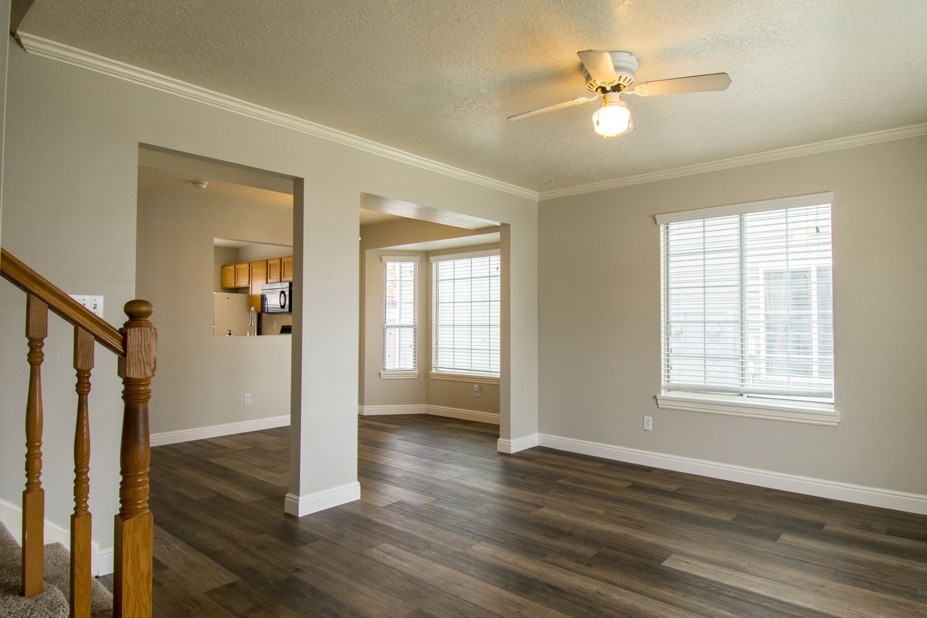
Pick a paint color in a store, carry it home to Torrance, and it often looks like a different color on the wall. The cause is almost never the paint. It is the light, the surrounding colors and the surface the paint lands on. A house a few miles from the Pacific Ocean gets a particular kind of daylight, and choosing a wall color well means working with it rather than against it.
Why does coastal light change how paint looks?
Morning in the South Bay usually starts under the marine layer, a thin gray blanket of cloud that softens and cools the light. Rooms look flatter and slightly bluer during those hours. By early afternoon the layer burns back, direct sun returns, and the same walls turn warm and bright. In the evening, low sun comes through west facing windows and rakes across the surface, pushing colors toward orange and exposing every roller mark.
A color that reads as a calm gray at nine in the morning can turn lilac at four. A cream that looks warm at noon can go dull and slightly green under the gray of a June morning. Nothing is wrong with the paint. The room is simply being lit by three different light sources in one day, and the wall color has to survive all of them.
What is an undertone, and why does it matter more than the name?
Every neutral carries a hidden second color, called an undertone. Whites lean yellow, pink, blue or green. Grays lean blue, purple, green or brown. Beiges lean pink or yellow. Two paints both named something like soft greige can sit side by side and look completely unrelated, because one leans warm and the other leans cool.
The easiest way to see an undertone is to hold a sample card against a sheet of plain white printer paper. The card will look cooler or warmer against the white, and the lean becomes obvious. Then compare that lean with the fixed colors already in the room: flooring, countertops, a brick fireplace, kitchen cabinets, a sofa that is not going anywhere. A warm yellow undertone fights a cool gray tile floor. A blue undertone makes a honey oak floor look orange.
How should each room be tested?
A small paper chip tells almost nothing. A proper test uses a larger area, painted on the actual wall, and watched across a full day.
- Brush two coats on a patch about two feet square, or paint a sheet of white poster board and tape it up so it can be moved around the room.
- Check it in the early morning under marine layer light, at noon, in the late afternoon and at night under the lamps that actually get used.
- Look at it from the doorway, not only from arm's length. Most people see their walls from across the room.
- Put a patch on each wall of the room. A wall that faces a window and a wall that faces away from one will not match.
- Leave the patches up for at least two days, including a gray morning and a sunny afternoon if the weather allows.
Which walls in a Torrance house get which kind of light?
Exposure shifts the answer for the same room. The table below describes general tendencies, not guarantees, since trees, neighboring houses and window size change things a lot.
| Window direction | What the light does | Colors that tend to hold up |
|---|---|---|
| North | Steady, cool and soft all day | Warm neutrals and soft yellows that offset the coolness |
| East | Bright and warm in the morning, flat by afternoon | Almost anything, though cool grays can look dull after noon |
| South | Strong and bright most of the day | Both warm and cool colors, with cooler shades staying crisp |
| West | Dim in the morning, intense and orange in the evening | Colors with a little gray in them, which calm the evening warmth |
Rooms with no direct window light, such as an interior hallway, depend entirely on lamps and bulbs. A warm bulb makes everything yellower and a cool daylight bulb pushes colors blue. The bulb temperature in a hallway is worth settling before the color is chosen, not after.
Do light colors always make a room look bigger?
Not always. A pale color on every surface can make a small room feel washed out, with nothing for the eye to hold on to. Light colors reflect more daylight, which helps dim rooms, but depth comes from contrast. A common approach is to run a lighter shade on the ceiling, a mid tone on the walls and a crisp, slightly brighter white on trim. The edges of the room become clear, and the space reads larger than it would if everything matched.
Dark colors can work in a room that already gets plenty of sun. They look rich in a west facing living room at sunset and sink into a closet in a north facing bedroom. Dark paint also demands better preparation, since glossy patches and uneven roller marks show up far more against a deep color. Patches sanded flush and sealed with primer are worth the time, and dark colors usually need a tinted primer underneath so that two coats of the final color actually cover.
How do surrounding colors change a wall?
A wall picks up reflected color from everything near it. A bright green hedge outside a window throws a green cast onto the nearest wall. A red tile floor warms the lower half of a room. Even a large cream rug can shift a gray toward yellow. When a color seems to change after the furniture arrives, this is usually why.
Fixed elements deserve the most attention. Countertops, backsplash tile, flooring and cabinet finishes will not move, so the wall color has to fit them. Fabrics and art can change later with almost no effort. Start with what is permanent and fit the paint to it.
How does sheen change the color you see?
Gloss level affects color perception as much as the pigment does. A flat finish absorbs light and looks deeper and more velvety. The same color in satin reflects more light and looks lighter and slightly cooler, with a visible glow when sun crosses it at a low angle. Choosing a color from a flat sample and then having it applied in semi gloss is a common source of disappointment.
When comparing options, sample all of them in the sheen that will actually be used. A color that looked right in a flat test patch may need to be shifted a shade deeper once it goes on in eggshell. Ceilings are usually flat, walls eggshell or satin, and trim semi gloss, so one color name on a can can show up three slightly different ways in a single room.
What about colors near the water and the Palos Verdes Peninsula?
Homes closer to the Pacific Ocean and toward the Palos Verdes Peninsula see more of the marine layer and more of the blue tinge that comes with it. Cool grays and blue whites can lean cold there for long stretches of the year. Many homeowners find that adding a touch of warmth, a gray with a hint of brown or a white with a faint cream cast, keeps rooms from feeling chilly on overcast mornings.
Further inland, around the Del Amo Fashion Center area and toward El Camino College, the layer tends to burn off earlier, and the afternoon sun is stronger. Colors that looked soft near the coast can look sharper there. The same swatch might call for a slightly greyer, quieter version on the sunnier side of town.
What makes a color choice hold up over years?
Trends change quickly, but the room stays. A few habits keep a color from aging badly:
- Choose from the fixed finishes outward, not from a favorite sample inward.
- Test in more than one spot and across a full day of light.
- Keep the trim and ceiling colors consistent through connected rooms, so the house reads as one place.
- Pick the sheen before the final color, then test the color in that sheen.
- Prefer colors with a little gray in them over pure, saturated tones, which tire the eye faster.
Surface preparation sits underneath all of it. Even the best color looks poor over a wall with unsanded patches, grease residue or old peeling layers. Washing, patching, sanding and priming come before the color is judged, and the final coat is the last thing, not the first.
A short way to decide
Narrow the list to two or three colors, paint large patches on the real walls, and look at them for two days. The one that still looks right on a gray morning, a bright afternoon and a lamp lit evening is the one to use.